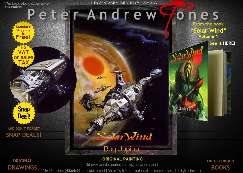
 Buy Jupiter (and other stories) Buy Jupiter (and other stories)
 (From the book "Solar Wind Vol.1") (From the book "Solar Wind Vol.1")
 By : Deborah Susan Jones : Editor By : Deborah Susan Jones : Editor
 Isaac Asimov's humorous short science
fiction story was first published in the May
1958 issue of Venture Science Fiction, an American
digest-size science fiction magazine, initially
published from 1957 to 1958 then revived for a brief run
in 1969 and 1970 and then Peter created the
cover for the UK paperback of the same name which
was in fact a collection of 24 short stories
ranging from 1950 to 1973. Isaac Asimov's humorous short science
fiction story was first published in the May
1958 issue of Venture Science Fiction, an American
digest-size science fiction magazine, initially
published from 1957 to 1958 then revived for a brief run
in 1969 and 1970 and then Peter created the
cover for the UK paperback of the same name which
was in fact a collection of 24 short stories
ranging from 1950 to 1973.
 The original title of the story was "It
Pays'", which was Asimov's own title which was replaced
with "Buy Jupiter" by Venture's editor at the time, Bob Mills and later,
in 1975, Panther Book's editor, Nick Austin, brought it
all together as a collection and Panther's Art Director,
Steve Abis, commissioned Peter to create a "space
hardware cover" which was the lead edge of Panther's SF
marketing stance in the mid 1970s. The original title of the story was "It
Pays'", which was Asimov's own title which was replaced
with "Buy Jupiter" by Venture's editor at the time, Bob Mills and later,
in 1975, Panther Book's editor, Nick Austin, brought it
all together as a collection and Panther's Art Director,
Steve Abis, commissioned Peter to create a "space
hardware cover" which was the lead edge of Panther's SF
marketing stance in the mid 1970s.
  One of the very first
"hardware" covers Peter created, he was naturally keen
to establish his own style for what was, undoubtedly, a
Chris Foss dominated market at the time of Peter's entry
into the genre. His description of his reasoning at the
time was > One of the very first
"hardware" covers Peter created, he was naturally keen
to establish his own style for what was, undoubtedly, a
Chris Foss dominated market at the time of Peter's entry
into the genre. His description of his reasoning at the
time was >
 "It seemed to me, that with the moon landing
and the whole NASA assertion that the public, even niche
SF fans, would have a core set of images in their mind
as to what a real spaceship looked like, even if set in
the future, and remember, Asimov's stories in some cases
dated back to the 1950s, so I set about designing a long
distance ship that on the one hand was classic yet
contemporary in feel whilst big enough in size
that it had to relate to future space travel". "It seemed to me, that with the moon landing
and the whole NASA assertion that the public, even niche
SF fans, would have a core set of images in their mind
as to what a real spaceship looked like, even if set in
the future, and remember, Asimov's stories in some cases
dated back to the 1950s, so I set about designing a long
distance ship that on the one hand was classic yet
contemporary in feel whilst big enough in size
that it had to relate to future space travel".
 Technically, it was one of the first
paintings painted on hardboard. Previously works had
been on stretched paper mounted on mount board, the
typical "art school" method of the time born out of his
training at St. Martin's School of Art, but this was
proving problematic since the illustrations, when sent
through the "art director to editor to photographer to
printer" pipeline, and back again to the art director's
office, was often a potentially damaging one and indeed,
one painting was cracked across the top half which
triggered a need to change the creative and presentation
process. Technically, it was one of the first
paintings painted on hardboard. Previously works had
been on stretched paper mounted on mount board, the
typical "art school" method of the time born out of his
training at St. Martin's School of Art, but this was
proving problematic since the illustrations, when sent
through the "art director to editor to photographer to
printer" pipeline, and back again to the art director's
office, was often a potentially damaging one and indeed,
one painting was cracked across the top half which
triggered a need to change the creative and presentation
process.
 "I noticed a comment
by Frank Frazetta in an interview at that time that he
painted on "Masonite" which meant absolutely nothing to
me since it was a proprietary brand name in the USA for
what I assumed we called hardboard but with a bit of
detective work looking closely at photos of Frank
holding his paintings it seemed to me that it was some
sort of wood panel, and probably an easily obtainable
and relatively cheap but durable product, so I just
assumed that hardboard would be a suitable UK version of
the kind of support he was painting on. In any event, be
that as it may have been, or not, that was my
interpretation so I set about locating a supplier, a
hardware store off Putney High Street in South West
London near where I was living, with my parents at the
time, and ordered a set of panels, cut to book cover
proportion and 'three times up" in size (to use the
industry slang of the era) to facilitate getting enough
detail into the image. The shop did an immaculate job,
perfect, delivered a big batch of panels to me and,
overnight, my working process shifted from
painting on paper to that of wood panel". "I noticed a comment
by Frank Frazetta in an interview at that time that he
painted on "Masonite" which meant absolutely nothing to
me since it was a proprietary brand name in the USA for
what I assumed we called hardboard but with a bit of
detective work looking closely at photos of Frank
holding his paintings it seemed to me that it was some
sort of wood panel, and probably an easily obtainable
and relatively cheap but durable product, so I just
assumed that hardboard would be a suitable UK version of
the kind of support he was painting on. In any event, be
that as it may have been, or not, that was my
interpretation so I set about locating a supplier, a
hardware store off Putney High Street in South West
London near where I was living, with my parents at the
time, and ordered a set of panels, cut to book cover
proportion and 'three times up" in size (to use the
industry slang of the era) to facilitate getting enough
detail into the image. The shop did an immaculate job,
perfect, delivered a big batch of panels to me and,
overnight, my working process shifted from
painting on paper to that of wood panel".
 "It wasn't a creative
choice through preference, it was a practical change to
protect the longevity of my work, especially the need to
ship it back and forth to my own photographer for
"shooting on tranny" (photographic 5x4 inch
transparency) for building what was to become "The Solar
Wind Picture Library", my own picture library and
licensing agency." "It wasn't a creative
choice through preference, it was a practical change to
protect the longevity of my work, especially the need to
ship it back and forth to my own photographer for
"shooting on tranny" (photographic 5x4 inch
transparency) for building what was to become "The Solar
Wind Picture Library", my own picture library and
licensing agency."
 "Heady days . . . . .
. . . . . . " "Heady days . . . . .
. . . . . . "
 Deborah Susan Jones Deborah Susan Jones

|


